Baby Friendly
Mobile App
UX design project @ General Assembly
UX design project @ General Assembly
Having a baby is a life changing experience and adapting to parenthood can bring a number of challenges.
A website or app to help new parents cut through the wealth of information.
There are lots of services new parents can use to good effect, it’s quite a crowded marketplace.
I interviewed four mums and one dad with ten week old babies. The main insights were that days can be repetitive and boring, but also unpredictable due to the baby’s needs. For many the lifestyle change is more of a shock than the birth.
Emily spends most of her time on her own at home looking after her twelve week old baby. She used to have a busy job in the city but has found being parent even more demanding.
She’s very tired due to lack of sleep and often home alone with limited adult contact. She’s quite bored as days are very repetitive and unpredictable events make planning difficult.
Her goals are to meet other parents at a similar stage and to find exciting things to do locally that she can take her baby to.

Emily has limited contact with other adults during the day and is bored and lonely.
An App that allows Emily to find things to do in the local area that are baby friendly.
Before I designed the first prototype I reviewed similar products on the market and discovered most had a prominent search feature, user ratings & reviews.
The path was good but users didn’t fully understand what the app was for.
To introduce some text that gave the app more context.
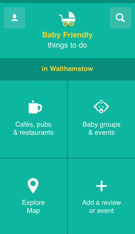
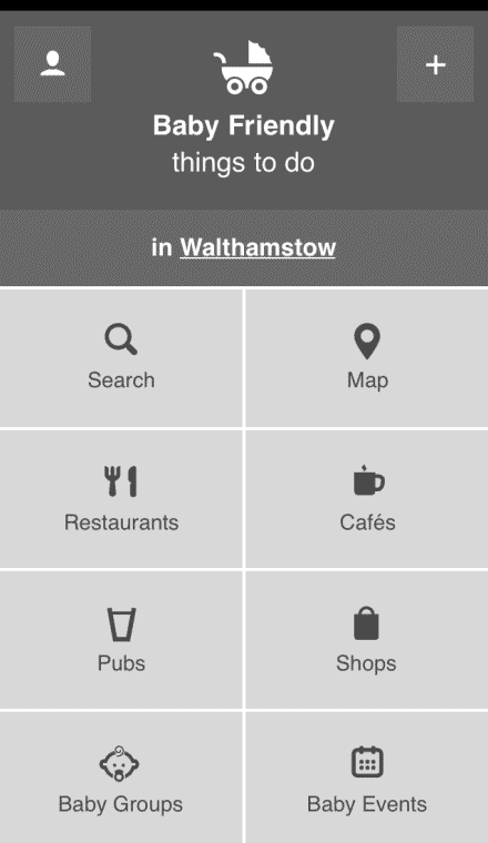
The home screen required some thinking to use and appeared complicated for some, it was also tricky to navigate whilst holding a baby.
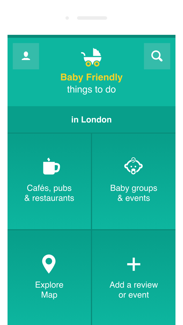
Re-design the home screen layout so that the buttons were larger and therefore easier to access with one hand.
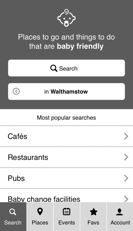
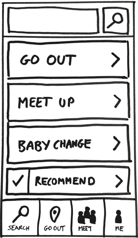
Users weren't sure of the difference between ‘Baby Groups' and 'Events’. Users didn’t want different sections for 'Cafes', 'Restaurants and 'Pubs'. Nobody used the search feature!
Re-design the home screen layout with fewer buttons and a smaller search.
The project was well received and General Assembly used it as a case study for future iterations of the course.