
ThirtyThree Website / UX Strategy & Design Leadership

The agency
had changed.
The website
hadn’t.

ThirtyThree had evolved, but its website no longer reflected the full breadth of what the agency offered.

I led the redesign, starting with research to understand what wasn’t working and helping establish a clearer direction for the business. I then took the project through design and into delivery.

Team /
UX, Brand & Insight, creative, copywriting, development and external SEO specialists
Role /
Digital Creative Director — Brand positioning, UX/UI, design direction and delivery
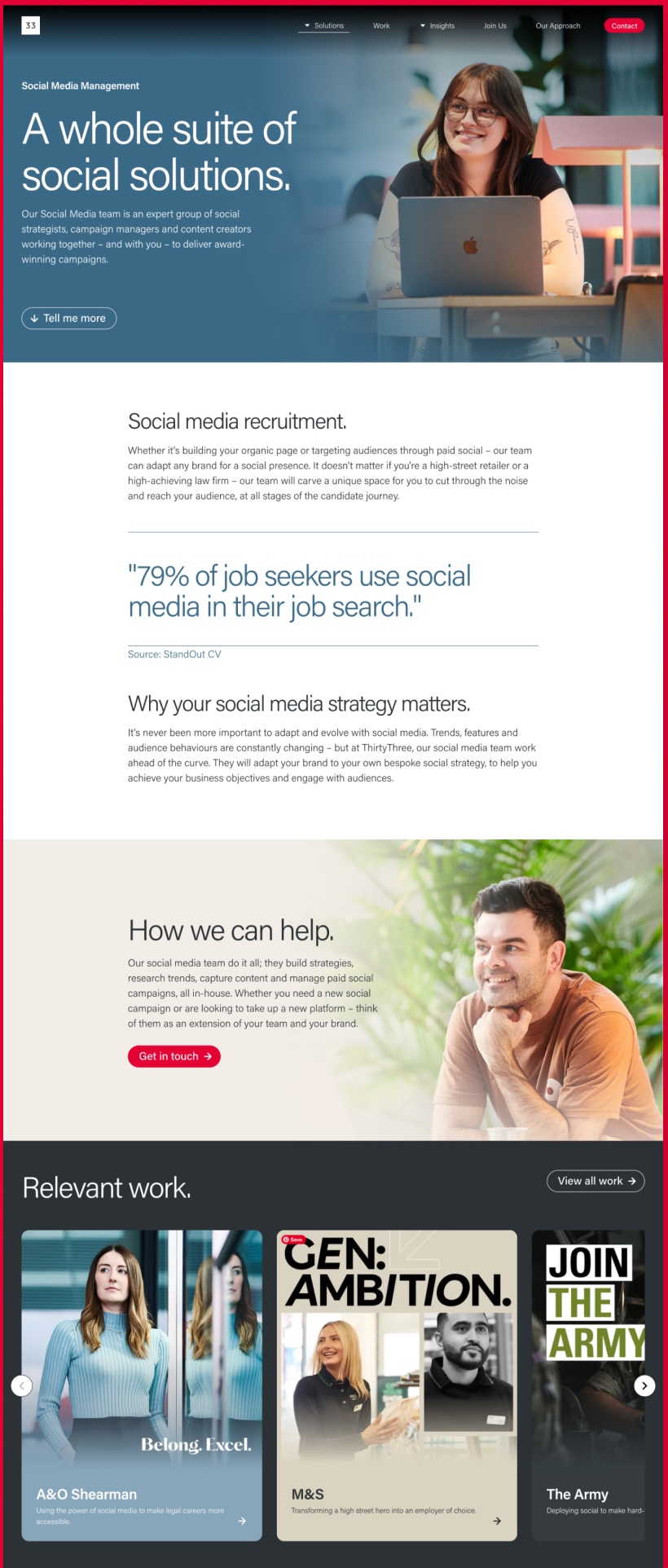
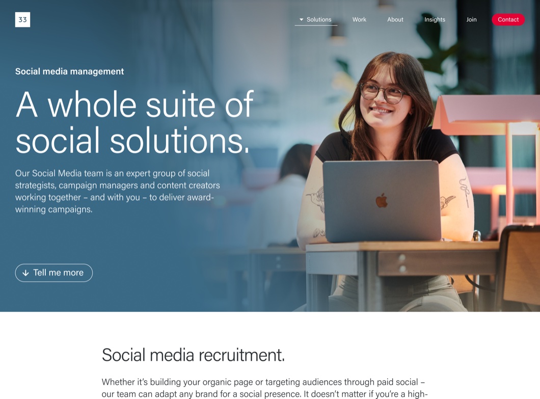
ThirtyThree’s social media management page
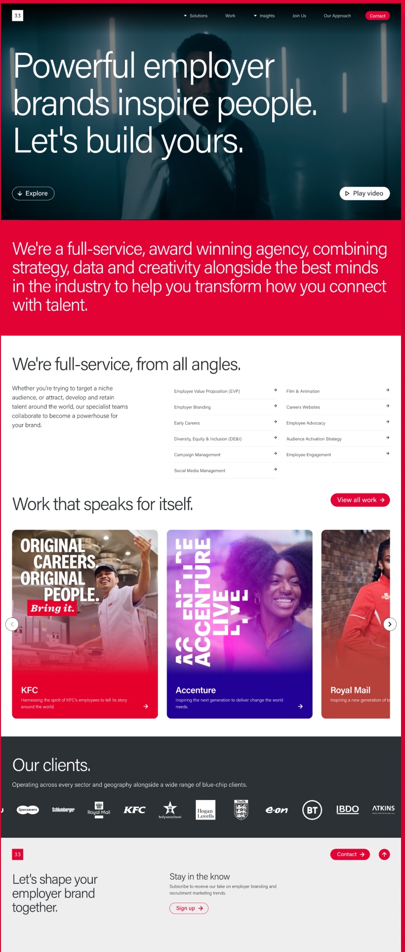
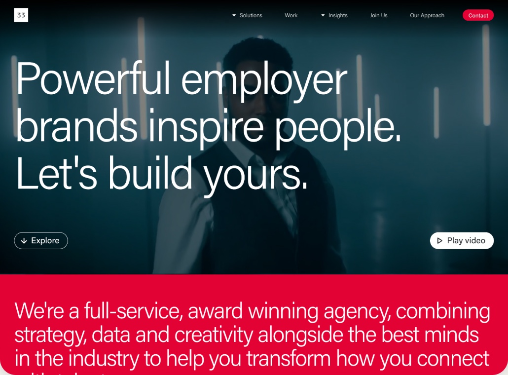
The redesigned ThirtyThree homepage featuring the agency’s new positioning
The redesigned ThirtyThree homepage on mobile
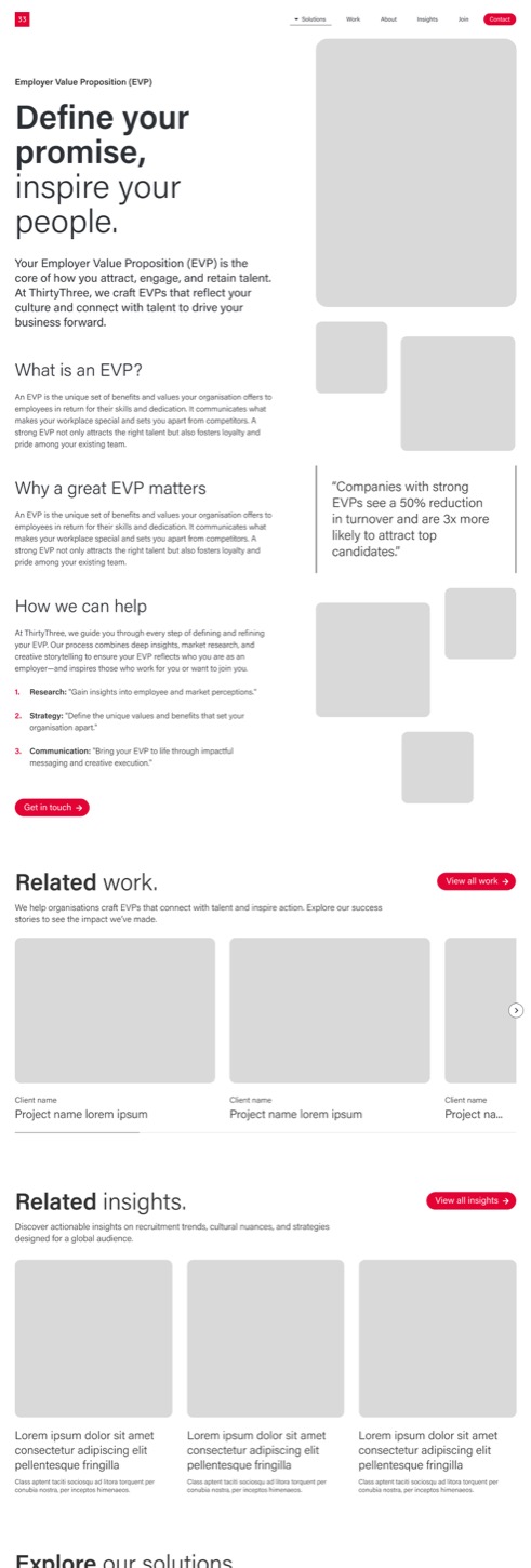
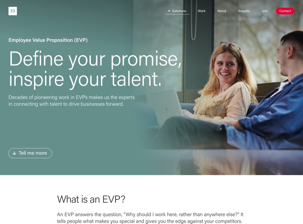
ThirtyThree’s Employee Value Proposition page

01 / Challenge

We needed more than
a new website.

The existing website was over five years old and no longer reflected the full range of services ThirtyThree offered.

The business wanted to reach more international clients and make better use of the site for marketing and sales. But without agreed brand positioning or a customer value proposition, we lacked a clear direction.

With just three months to deliver, including Christmas, we needed to establish one quickly.
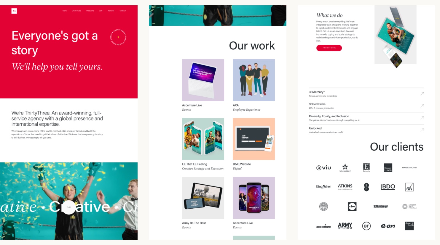
Three pages from the previous site showing the homepage, work and clients
Previous website design

02 / Discovery

Finding out what wasn’t
working.

I reviewed the site’s structure, content and Google Analytics data to understand what was working and where we could improve.

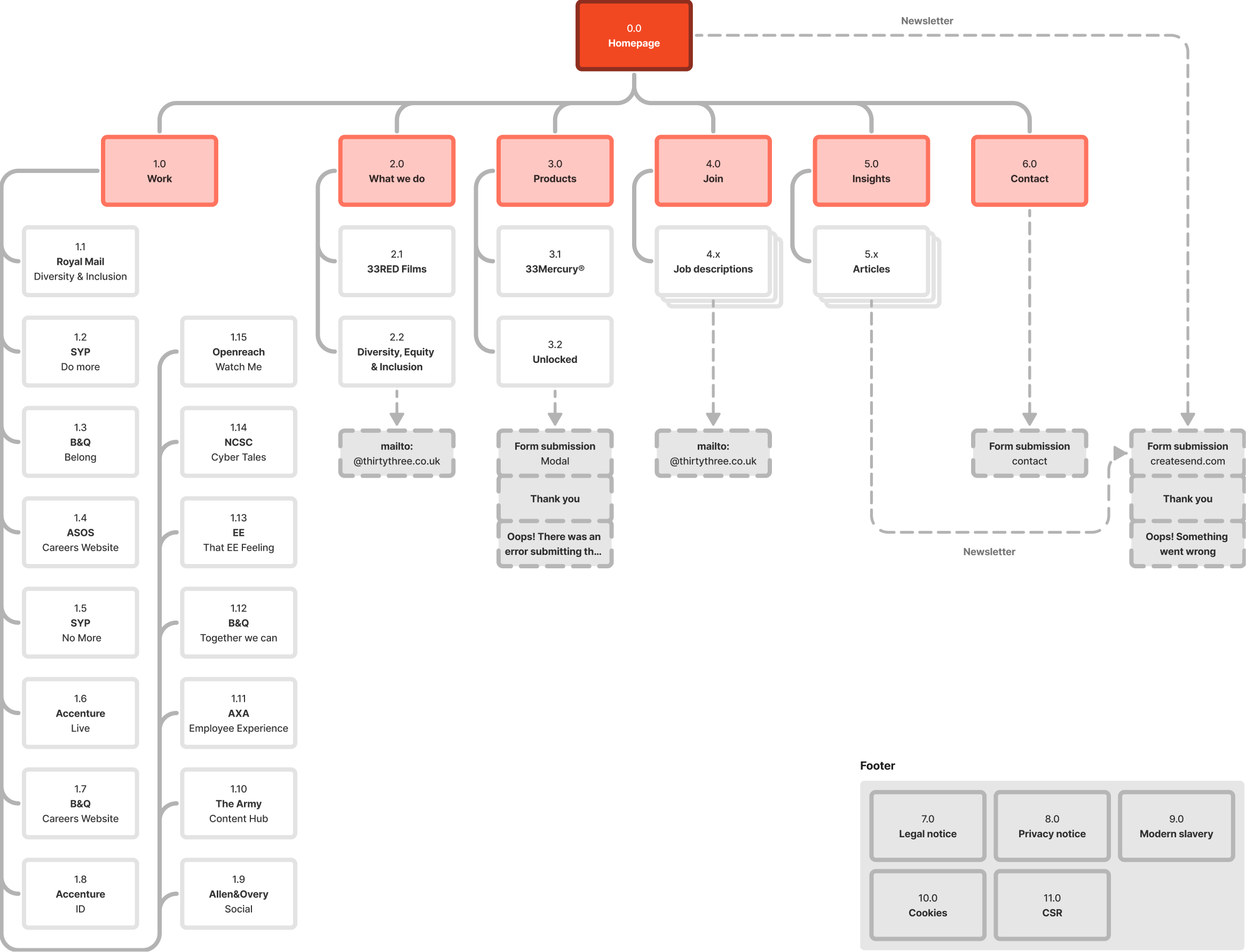
Previous sitemap, showing the old navigation and page hierarchy
Previous sitemap

I also gathered feedback from clients and people across the business.

Four issues stood out:

  1. Unclear services.

    The navigation was confusing and didn’t represent everything the agency offered.

  2. Inconsistent storytelling.

    Case studies varied in quality and rarely connected the work to meaningful outcomes.

  3. A faceless experience.

    Clients wanted to know who they’d be working with, not just see the finished work.

  4. Disconnected content.

    Services, case studies and insights weren’t linked in ways that helped visitors explore our expertise.

03 / Direction

Before designing the
website, we needed to
agree what ThirtyThree
stood for.

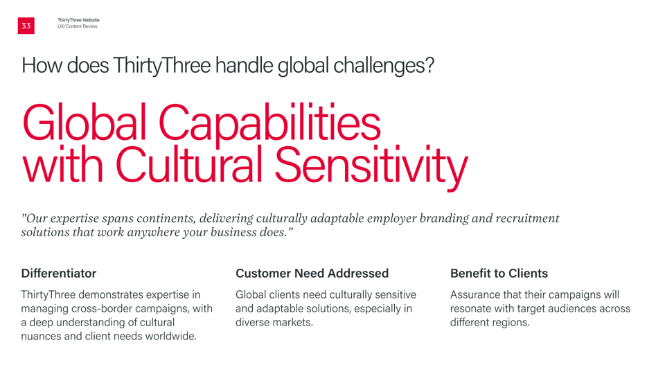
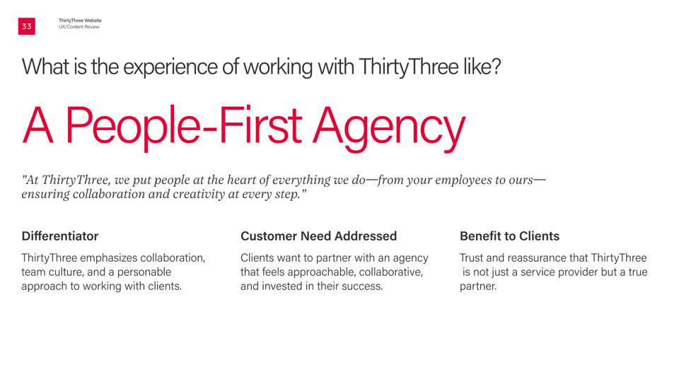
I proposed developing a Customer Value Proposition (CVP) to give the redesign a clearer foundation.

I gathered perspectives from leadership, sales, client services and specialist teams. Using AI to help synthesise the findings, I developed an initial draft within a week. The Brand & Insight team then tested and refined it with people across the business, helping establish a shared direction.

It also helped us navigate questions about our positioning, including how to communicate our international capabilities without overstating our global presence. We now had a foundation for the website’s structure, messaging and design.

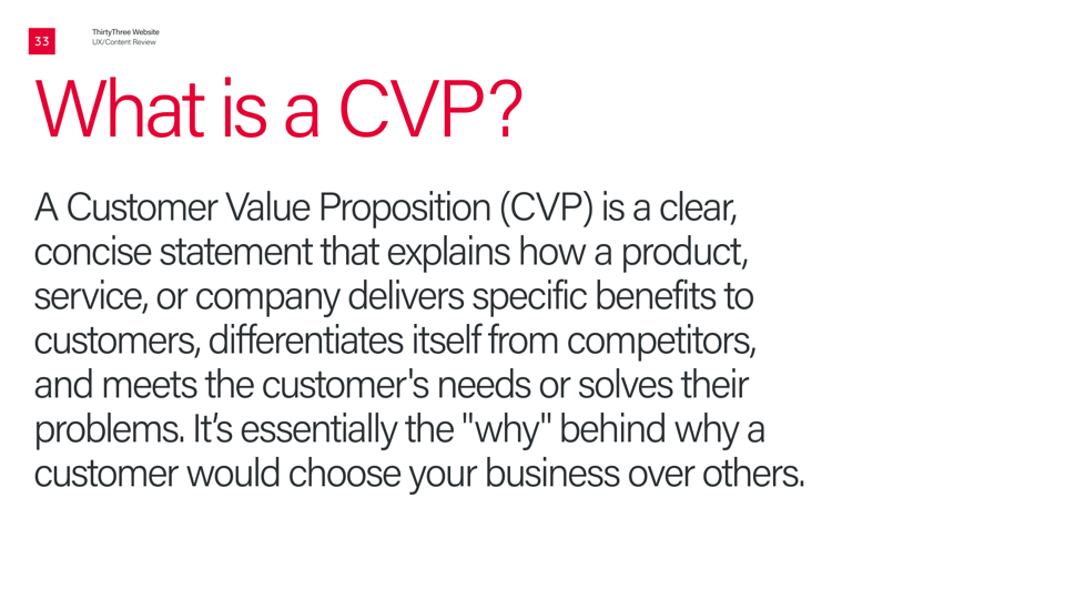
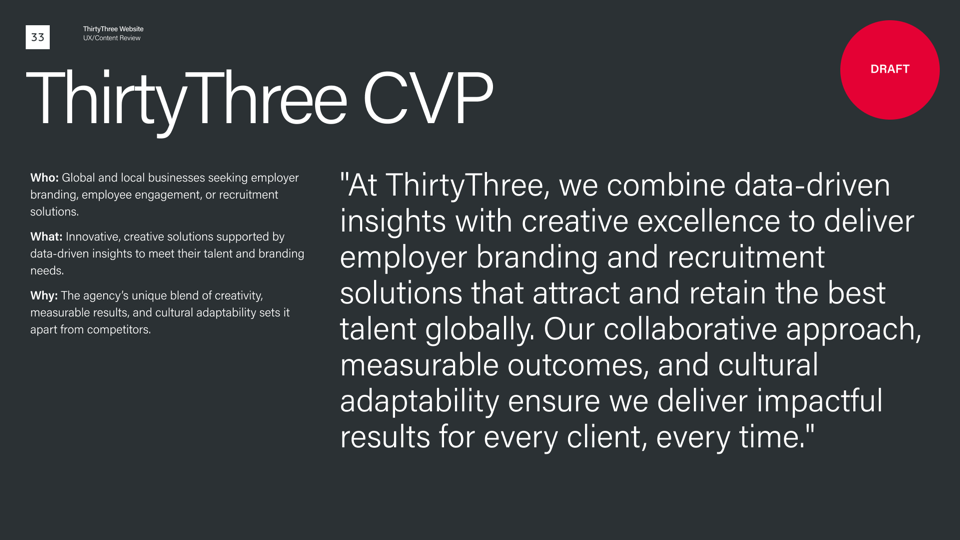
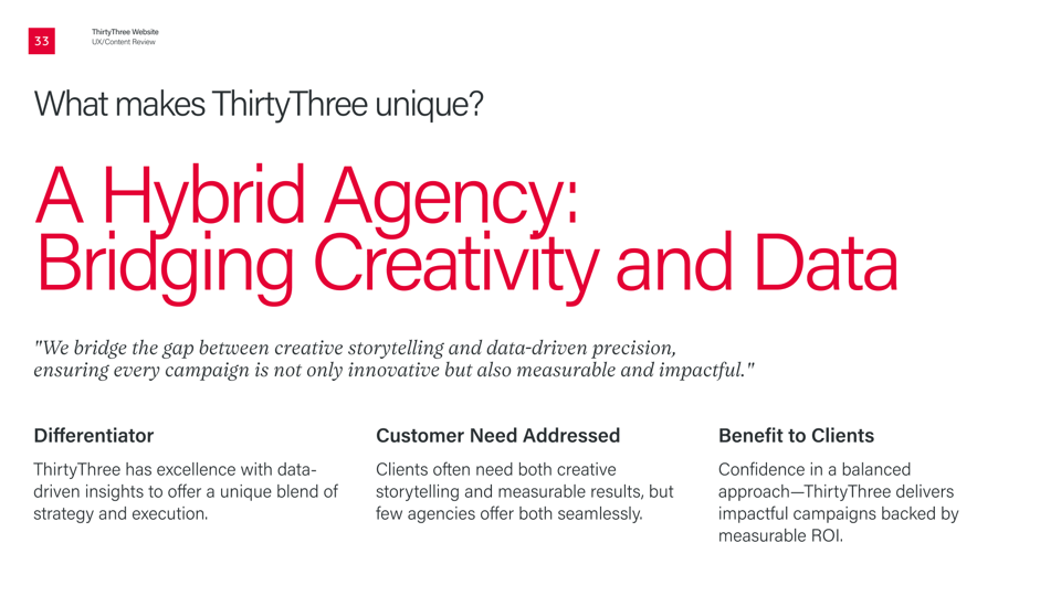
ThirtyThree Customer Value Proposition What is a CVP? ThirtyThree’s customer value proposition A hybrid agency combining creativity and data Global capabilities with cultural sensitivity A people-first agency
Sample pages from Customer Value Proposition deck

04 / Design

Making it easier to
understand what we do,
and why it matters.

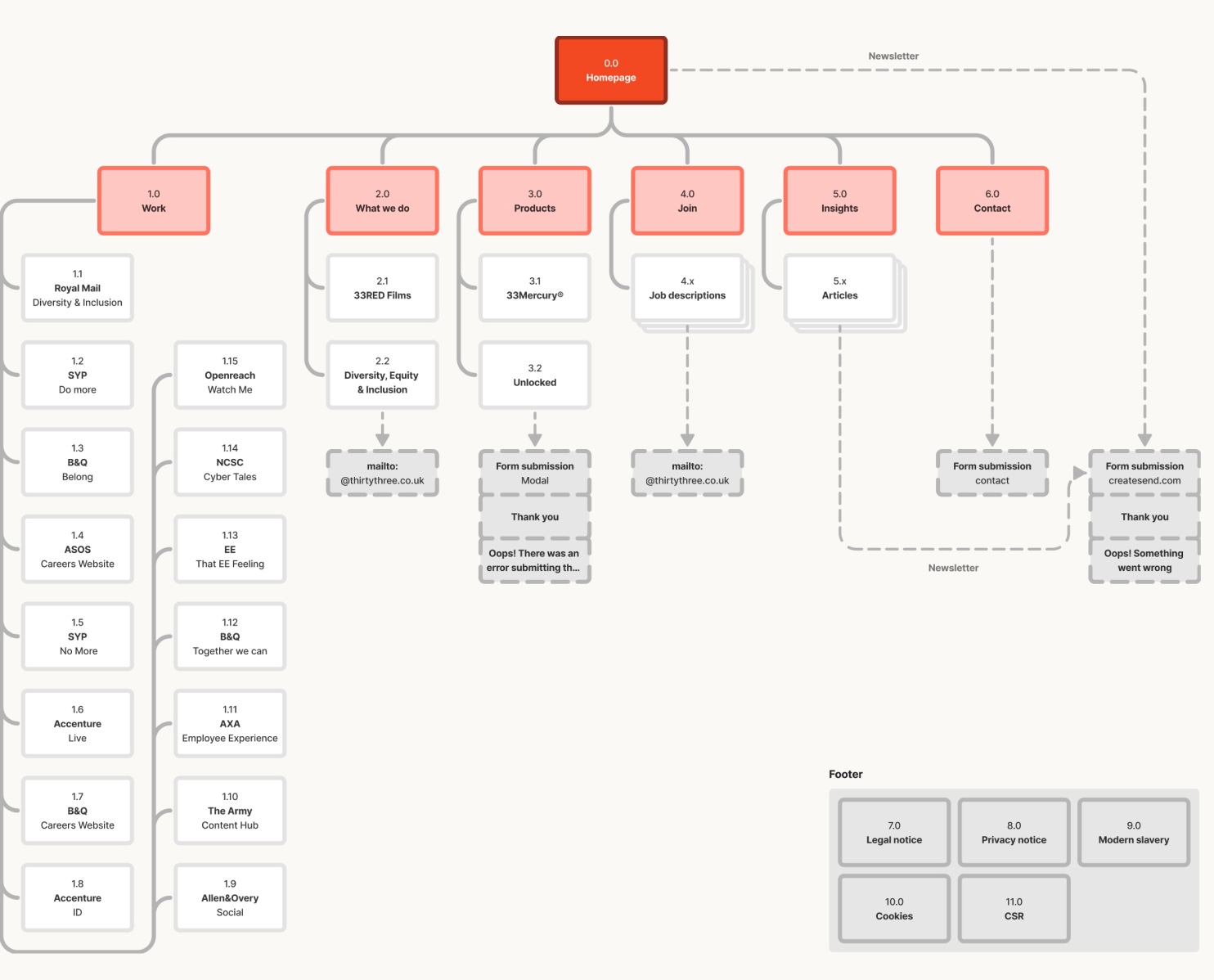
I reworked the information architecture to make services easier to find and create clearer connections between our expertise, work and insights.

Signed-off sitemap, showing the revised navigation and page hierarchy
Signed-off sitemap

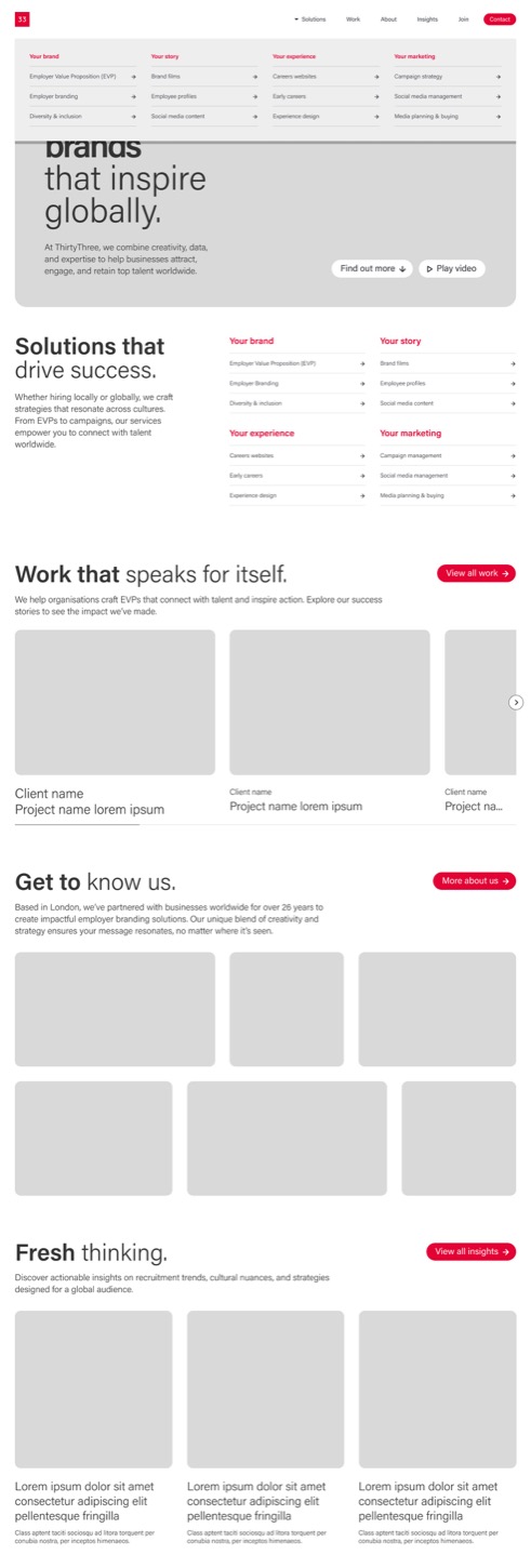
Working with an external SEO partner, I balanced a simpler user experience with the need for relevant, discoverable content.

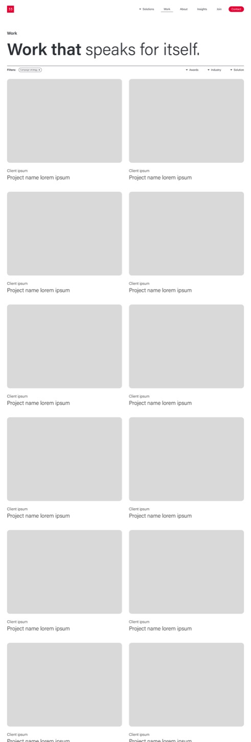
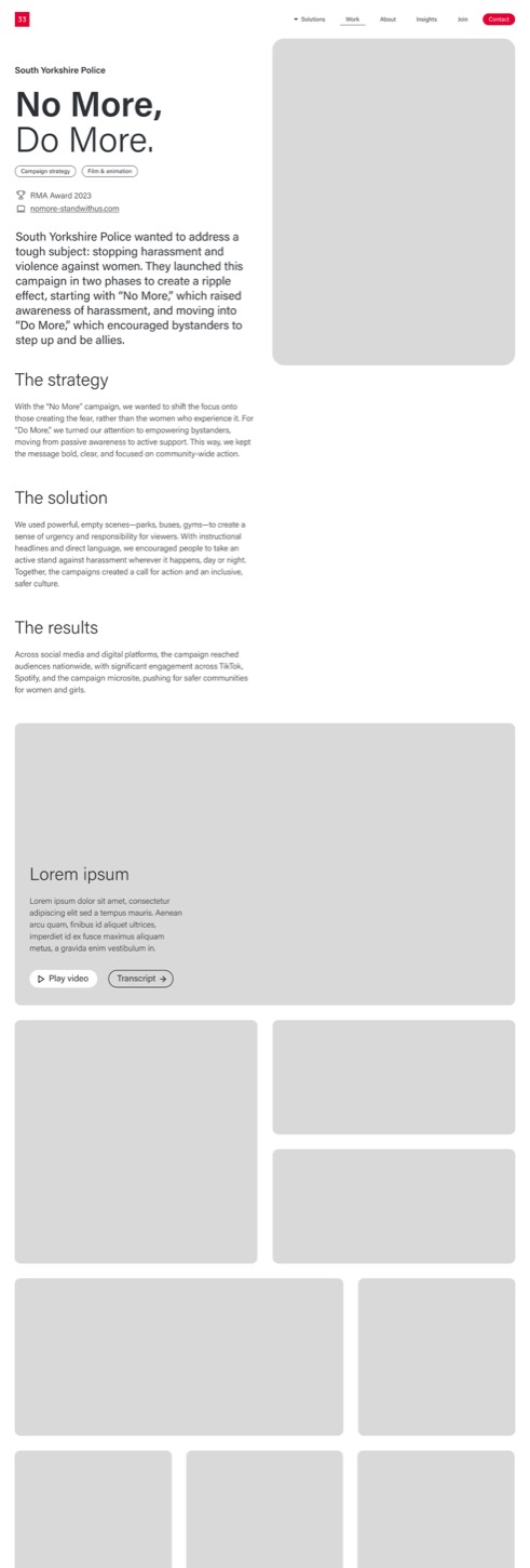
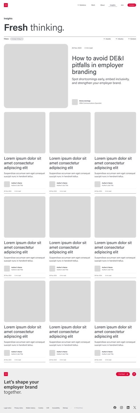
Homepage and navigation wireframe Employer value proposition wireframe Work overview wireframe Case study template wireframe Insights overview wireframe
Sample desktop wireframes

Client feedback also shaped the visual direction. The existing site felt cold and impersonal, so I developed a more people-focused approach, including the photography brief and art direction.

A colleague working at a laptop in the ThirtyThree office Two colleagues talking on a sofa A colleague smiling during a meeting A colleague standing in the office corridor
Samples from photoshoot

I also worked with senior writers to refine a tone of voice that felt more consistent and approachable.

The aim was to create a clearer, more human experience without losing ThirtyThree’s creative personality.

05 / Delivery

Keeping the project
on track

By Christmas, resources were stretched, project managers had left and new requests were arriving outside the agreed process.

I took on project management alongside leading the design, but we needed to get everyone back on the same page.

In early January, I presented a mid-project review to the CEO and COO, revisiting the brief, research, design progress, outstanding decisions and delivery risks.

This helped clarify what was achievable, what still needed approval and how we could move forward.

I followed it with clearer sign-off points, project tracking and regular updates to keep delivery moving.

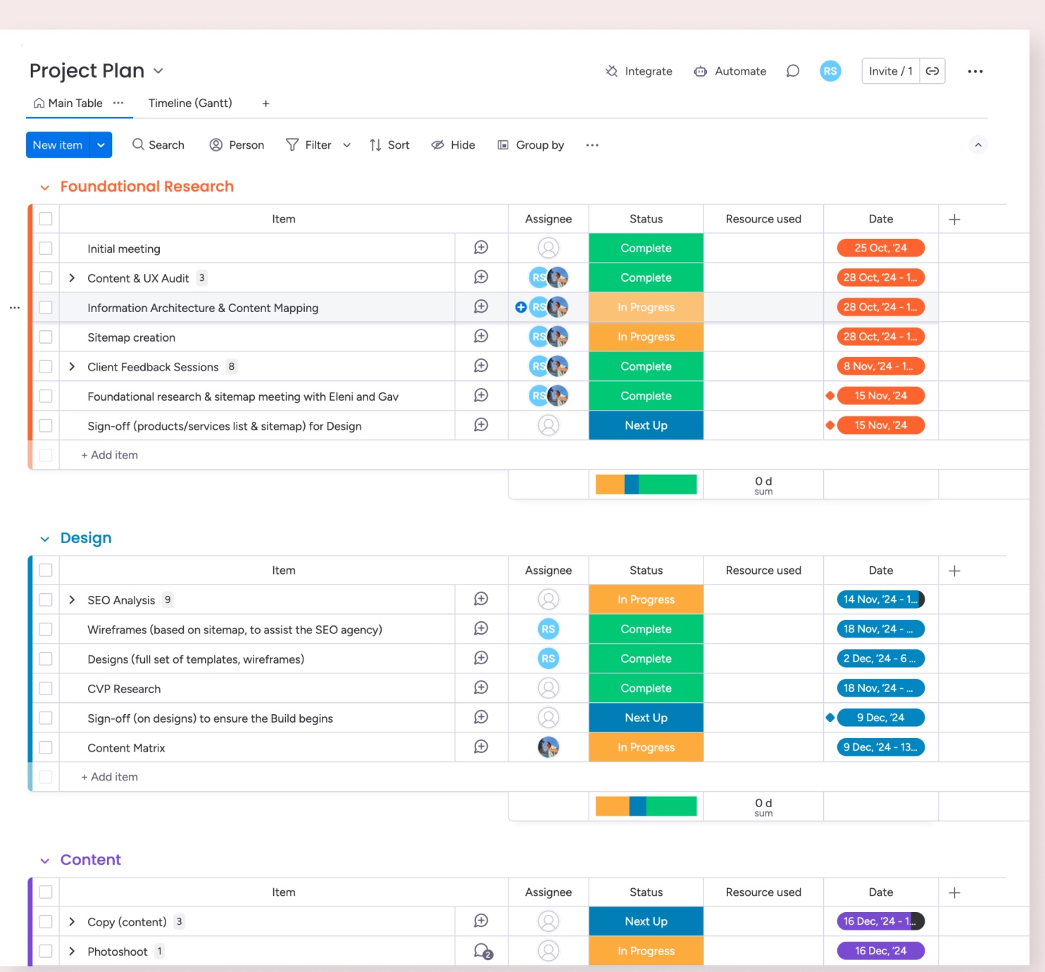
Monday.com board showing workstreams, owners and delivery status
Monday.com project plan

06 / Launch

Bringing everything
together.

I worked closely with the developer throughout the build, reviewing implementation, resolving design issues and coordinating stakeholder feedback.

We also managed the move to thirtythreeglobal.com, working with our SEO partner to plan redirects and address the risks to existing search visibility.

The redesigned website launched in February 2025, three months after we started, bringing together the new positioning, content structure and visual direction.

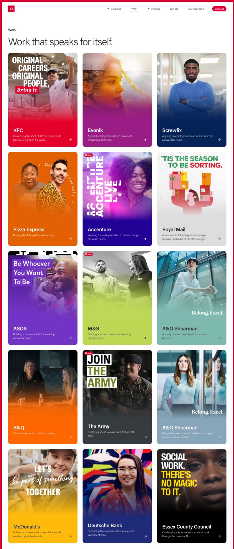
Redesigned ThirtyThree Homepage Redesigned ThirtyThree About page Redesigned ThirtyThree Work page
Website designs

07 / Reflection

More than a website
redesign.

The project delivered a new website that better reflected the breadth of ThirtyThree’s services and presented the agency in a clearer, more human way. It also established several foundations for future communications:

  • A customer value proposition developed with input from across the business.
  • A shared direction for tone of voice and messaging.
  • A clearer structure for services, work and insights.
  • A more people-focused visual approach.
  • A stronger foundation for marketing and sales activity.

What began as a website redesign had also helped the business better articulate what it could offer clients.

View website